bzzd: using social pressure to create mindfulness around drinking
by Lidia Balanovich and Sebastian Logue
Overview
Excessive alcohol use is most prevalent on college campuses, where the binge drinking rate among students is approximately 40%. This has led to many concerns about student safety, but the several attempts at reducing student alcohol consumption have not been as effective as expected. While college administrations can continue to update their alcohol policies, we cannot hope for change unless the students themselves take charge of their own alcohol consumption.
In order to combat this issue, we created an app called bzzd that lets users going out in a group keep track of their friends’ locations and drinking. Users first set their Blood Alcohol Content (BAC) limit that they do not want to surpass. Every time they consume a drink, they add it to their in-app total, which takes into account factors such as gender, height, and the timing of the drink to update their BAC. Users are able to see their own and their friends’ status bars displaying how close they are to their limit. If the user’s friend reaches their BAC limit, the user is notified so that they can make sure their friend is safe and does not drink anymore.
Beyond alcohol consumption, bzzd also ensures that a group of friends stays together. Using a mesh network, the app tracks the location of the user’s friends and whether they are in the user’s general location. If a friend gets too far out of range, the user is notified that their friend is no longer nearby. The user can then access a map to see where their friend is, and have the option to call them or flag them. When a friend is flagged, they either respond with “I’m safe” or “I’m in trouble.” This can give the user updated information about the status of their friend so that they can ensure their safety.
The idea for and the design behind bzzd did not come packaged in one brilliant insight. We went through a long process that involved lots of brainstorming, user research, and several iterations. This case study details the steps of the design process that got us to our digital solution targeted at increasing student mindfulness about alcohol and their friends when going out.
Initial Insights
Interviews: Round 1
At the very beginning of our process, we started by simply asking fellow students:
What do you wish you were more mindful of?
This was a fairly blunt technique, but it cast our net wide and far as we gathered as many possible topics as we could. Despite being a basic question, it returned some very intriguing results. We got a number of responses about mental health, eating habits, sleep, and utility usage, which, while interesting, are areas that have extensively developed digital solutions, leaving us unsure of how we might be able to meaningfully innovate. Among these somewhat cliche topics however, we interviewed a couple people who mentioned wishing they were more mindful of their drinking. To our knowledge, this was not a well explored topic for digital solutions, and there appeared to be a real and corroborated need.
User Journey
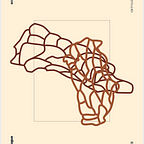
However, before diving into drinking specifically, we wondered if drinking were actually the real problem, or if it were the perceived symptom of another, greater problem in the user experience of going out to party for the night. To analyze this, we mapped out the user journey for this experience to understand where the user encounters difficulty:

This need-finding left us with two real issues for users:
- losing friends during the night
- over-consuming alcohol
How Might We?
Because of what we had heard in our initial interviews, we chose to continue with the concept of drinking mindfulness, settling on the project purpose of:
How might we reduce a college student’s chance of drinking too much in one night?
Competitive Research
As we set out to understand how to promote drinking mindfulness in students, we first researched what applications might already so something similar. We combed the App Store and found that there were no applications designed specifically for this purpose, and the next closest options are either debilitatingly complex, making users enter exact amounts, alcohol percentages, and drinks types, or very poorly designed, clearly lacking much thought or effort. This information gathering left us confident to move forward with our concept, knowing that we were entering a novel space of app development.
User Research and Brainstorming
Sketching: Draft 1
Settled on our concept, the next step was to develop our actual solution. Like our initial insights, we started broad, with a session of very short sketching, forcing ourselves to just put down ideas, whatever they may be:

Interviews: Round 2
Now that we had some very rough ideas, we moved onto a second round of interviews to get students’ impressions of our possible solutions, and give us a direction before we embarked on the low-fi prototyping process. Outlined below is our interview methodology:
Part 1: General Findings
- How old are you?
- Do you usually “go out” on campus? If so, how often do you do that?
- Please describe an ordinary “on night” for you. Where do you go? Do you usually consume alcoholic beverages?
- How do you feel about your alcohol consumption?
- Have you ever felt like you have lost control with alcohol? (**only if comfortable**)
- Do you usually go out with others? How does your alcohol consumption compare to your friends?
- Have you ever been concerned about a friend’s alcohol consumption?
- How do you watch out for your friends’ alcohol consumption?
- At what point might you decide that a person is too intoxicated and should be walked home?
Part 2: Testing Solutions
- Do you have a way to track how much you or a friend drinks in one night? If not, do you feel like that’s something you need to track?
- Do you have a way to track how often you drink in a longer period of time (weekly, monthly, termly, yearly)? If not, do you feel like that’s something you need to track?
- Do you think you would use a digital tool to track something like that? Why or why not?
- Are there any features that you think would be really helpful to keep you and others safe?
Results
From our second round of interviews, we gained three particularly important insights that completely shifted how we approached our solution, and restructured the purpose of our app:
- First, people who said that they think they might over-consume alcohol more regularly than their friends were hesitant about the idea of recording their own drinking, and were afraid of seeing the results.
- Second, on the other side, people who said they generally consume less than their friends were concerned about their friends’ drinking and wished they had a way to know how many drinks that friend had drunk that night, so that they could prevent them from over-consuming.
- Lastly, our subjects pointed out that if they don’t know where a friend is located, a common problem in the types of crowds encountered at parties, it’s impossible to help them stay in control.
Changing Our Purpose
From our second user interviews it became clear to us that we needed to reframe our problem and shift our purpose.
We went back to our original “How Might We” statements, now knowing that the other pain point we had identified, “losing friends during the night”, was actually an integral component of the drinking problem we were trying to address.
To find a solution to the first and second insights of our user interviews, we experimented with, instead of having the app target mindfulness of personal drinking habits over longer periods, pivoting towards the more immediate issue of informing close (only people added by the user) friends when the user has had too much to drink. As we contemplated this, we realized that sharing that information would not only resolve our second insight, but likely have a double effect in terms of a social pressure to record drinks on those who tend to over-consume and said they would be less likely to tally their drinks.
From these findings, we synthesized a reworked version of our original How Might We statement:
How might we reduce a college student’s chance of drinking too much in one night and allow others to see how much they have had to drink?
with a new HMW statement based around losing friends:
How might we help students keep track of and in touch with their friends when going out?
giving us the final purpose:
How might we help students be mindful of their friends’ drinking and location when going out?
Prototyping
What to Prototype?
With the short time limit of this project, we had to prioritize the development of certain features over others. For the homepage, there could be almost an unlimited number of states. What would it look like if more than one friend was in trouble? What would it look like if a friend was out of range, safe, but over their limit? It would not be realistic to design all the possible states, so we narrowed it down to the core ones that would best display the app’s features:
- Friend is over alcohol limit
- Friend is out of range
- Friend that is out of range is flagged
- Friend that is out of range and has been flagged responded that they are “not ok”
- Friend that is out of range and has been flagged responded that they are “ok”
Other pages that we decided to prototype:
- Registration page (to display what information the app uses to update BAC)
- Personal drinks statistics page
- Friend information page (opens when their card is pressed)
States
Now we had a solid understanding of what kind of information would be most important to the user and what kind of features could incorporate that information. With this, we moved into Figma to wireframe.
One of the biggest issues we had was separating out our states so that the user would be able to quickly understand the status of their friends. We also had to maintain simplicity and consistency for the benefit of the intoxicated user.
The first step to alerting the user that the status of their friend had changed had to be made clear as soon as they opened the app. We made the decision to have a friend’s card move to the top of the screen and expand to fit the full width. The friend could be lost, past their limit, or in danger, but with this state the user would know to prioritize this friend’s card over all of the others.
The difficulty came in separating the states of a friend that has reached their limit and of a friend that has gone out of range. These states had to be distinct enough so that the user would know how they could help their friend at a glance, and so that the states could occur at the same time without confusing the user. We also needed to incorporate three additional states on top of the “friend out of range” state: the “friend has been flagged” state, the “friend is in danger” state, and the “friend is safe” state.
In the beginning of our design process, we experimented with colors and gradients to denote each state. The idea was to fill the drink limit bar with a gradient when the limit is reached, and color the card red if the friend went missing. If the friend was flagged and was in danger, the escalation state was a bright moving gradient on the card.
As we hashed out these details, we decided that organizing different states and their UI in a table would be the most helpful:

We then developed a set of grayscales based on these different states:


However, while we were satisfied with the UX portion of this idea, once we started experimenting with the gradient colors and other UI, the concept didn’t feel natural:

We concluded that colors was not enough. Not only did the reliance on colors reduce accessibility to color-blind people, but these states would require the user to think to figure them out, taking away from the simplicity. Because of this, we decided to include supplemental texts and icons and get rid of the gradients completely. We saved coloring the card red for the most important issue, a friend that is lost and in trouble, and used other colors and icons to create a hierarchy of priority for the other states.
Final Solution
During the initial development of our final prototyped UI, we made two critical decisions:
Color
First, we started with a bright, contrast heavy color scheme and design. This seemed like the best course of action, because it would allow us to call attention certain elements of the UI as needed to alert the user, but as we worked through the UI (eventually testing it by accident in a dark dorm room), we realized that for an app that would be almost entirely used at night, a darker UI would be easiest on the user’s eyes. This may seem like a small modification, but it really impacted the usability and overall aesthetic of the design, ultimately further refining it for our specific purpose.
Cards
Second, we tried out a number of different appearances and layouts for the friends cards. We tried adding more information like BAC percentage as well as playing with the graphic layout of the cards, but we eventually realized that, especially considering the potential that the user is inebriated, the best course of action would be to give the absolute most basic info on the card: picture, name, and status bar of BAC compared to limit. Then, if the user wanted more information about their friend, a tap would open a new, full-page window with additional information like location and actual BAC percentage.

User Testing
Our biggest concerns about our app design were whether users are able to tease out the meaning of the cards and states, and whether users are able to understand the functioning of the flagging feature. We created a list of key features and actions that users could either get right, partially right, or wrong. This way, we could not only measure our points of concern, but also other features that seem intuitive to us but may not be to the user. We asked three users some background questions, gave them the quantitative test, and then asked some follow-up questions to probe general feedback.
The Quantitative Test:
Sign Up
- Why do you think the app asks for your gender?
- Why do you think the app asks for your birthday?
- Why do you think the app asks for your weight?
- Why do you think the app asks for your height?
- How do you feel about choosing a BAC that works for you?
- Watch to see if they scroll through the “Add Friends” list
Homepage
- How do you add drinks?
- What information do you think will open when you click on your profile?
- What do you think this status bar represents?
- What information do you think will open when you click on your friend’s card?
- What do you think happens if you press ‘flag’?
Understanding States
- Does the user know what the “friend past limit” state means?
- Does the user know what the “friend out of range” state means?
- Does the user know what the “friend in trouble” state means?
- Does the user know what the “friend safe” state means?
The users we performed the tests on had a solid understanding of how the app works, and all of them understood what flagging meant. Furthermore, all subjects had some knowledge about BAC- enough to know what kind of factors influence it (such as weight, gender, etc).
One comment from User #2 that struck us was “it’s so easy to add drinks!” While that was meant to be a compliment about the simplicity of our app, it made us realize that we had made it too easy to add a drink. What if users mistakenly added a drink? We needed a way to add an “undo” option without disrupting the layout and hierarchy of the app. Fitting a subtraction button without making other elements on the “you” card was unrealistic, and we wondered if the undo button was worth the sacrifices of other features. Ultimately we made the decision to make the adding button smaller to add a subtraction button because of the possibility of false alarms from over-adding drinks outweighed the look of the app. In this case, UX beat the UI.
Conclusion
The idea for our app has gone through several iterations, but after user research and testing, we feel confident in its practicality and design. Not all of the features have been fully fleshed out, but our project has laid out the fundamentals that make bzzd an app focused on increasing mindfulness about yourself and others when consuming alcohol in a social setting. Though the initial idea was centered around personal tracking, switching over to a more social focus tackles the general pain point of mindfulness about alcohol while also ensuring that others can stay accountable for an intoxicated user if they no longer have the capacity to.
Our prototype, however, is just the beginning. Given more time, we would add additional features that would strengthen our solution to our How Might We question. Some of our ideas for next steps include:
- Deciding a time when the night ends and the app resets
- Being able to tell friends you are in trouble without being flagged
- Working out other app basics such as profile settings and adding friends
- Making it easier to add drinks with apple watch app and/or sticky notification on lock screen